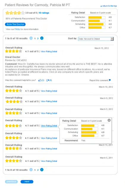
Planning an enhancement to allow Patients to rate Physicians (PRP) was one of my primary IxD projects
What we had before: The Blue Cross Blue Shield Association (BCBSA) mandated that all Blue’s allow patients to rate and comment on physicians. Our task was to integrate user feedback into our physician search tool.
Find a Provider (FAP) is one of BSCA’s most utilized web applications. Customer satisfaction surveys rank FAP as one of our users’ areas of greatest discontent. Performance is a major issue for most users (ex: 8-12 seconds page load and routine stalling of page load). The user experience is also not yet ideal – FAP is often seen as clunky and difficult to use.
PRP will be the first time BSCA customers can utilize web 2.0 features, such as rate and comment, on the BSCA website.
Solutions we created: Working with Vitals, our selected vendor, and coordinating with in-house and off shore developers, UX was able to complete on time all required tasks for MVP. We had an extremely aggressive schedule in order to meet the Association’s mandated deadline. Early collaboration with Business stakeholders was key.
By working closely with Vitals and the Dev team, UX was successful in balancing the mandate to add a new feature with the importance of not creating a noticeable additional performance lag.
UX work was based on successful design patterns and familiar formats from industry leaders such as yelp and amazon.
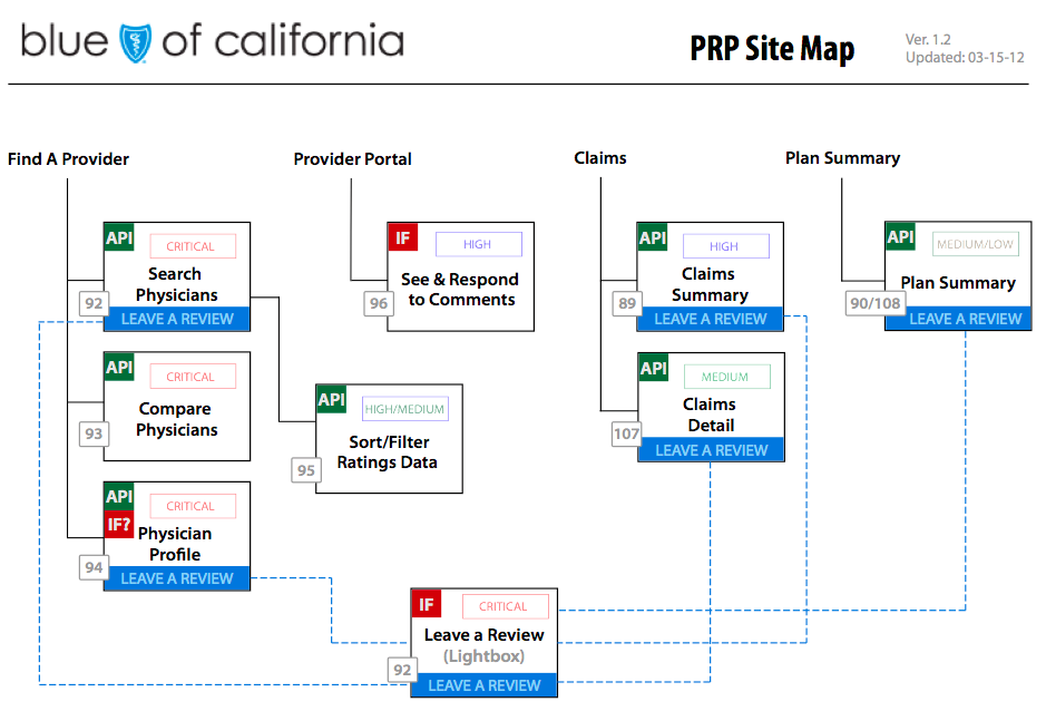
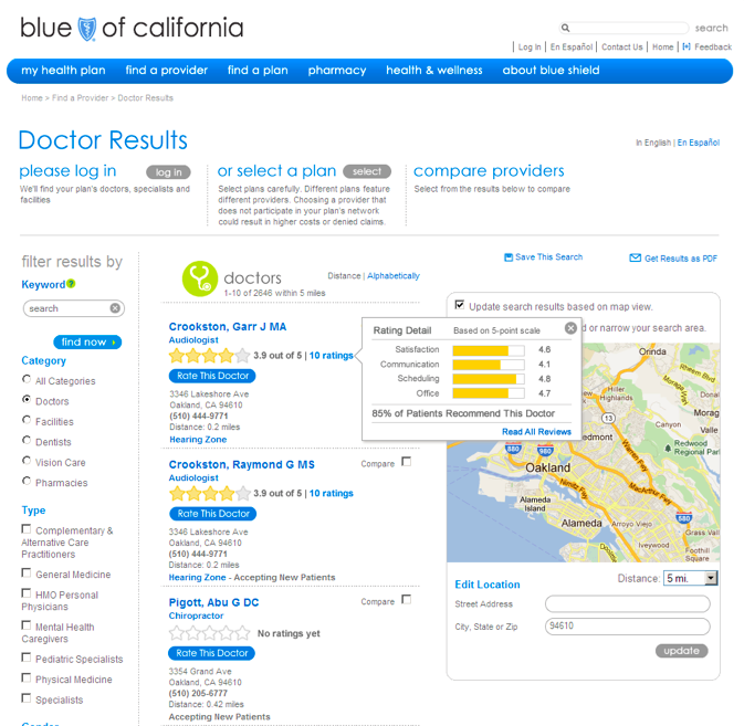
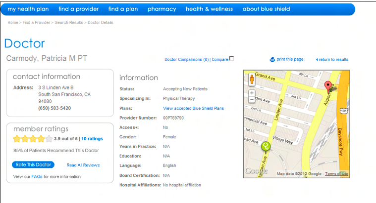
- Use of API and auto resizing iframe: to integrate vendor solution into the BSCA site and brand.
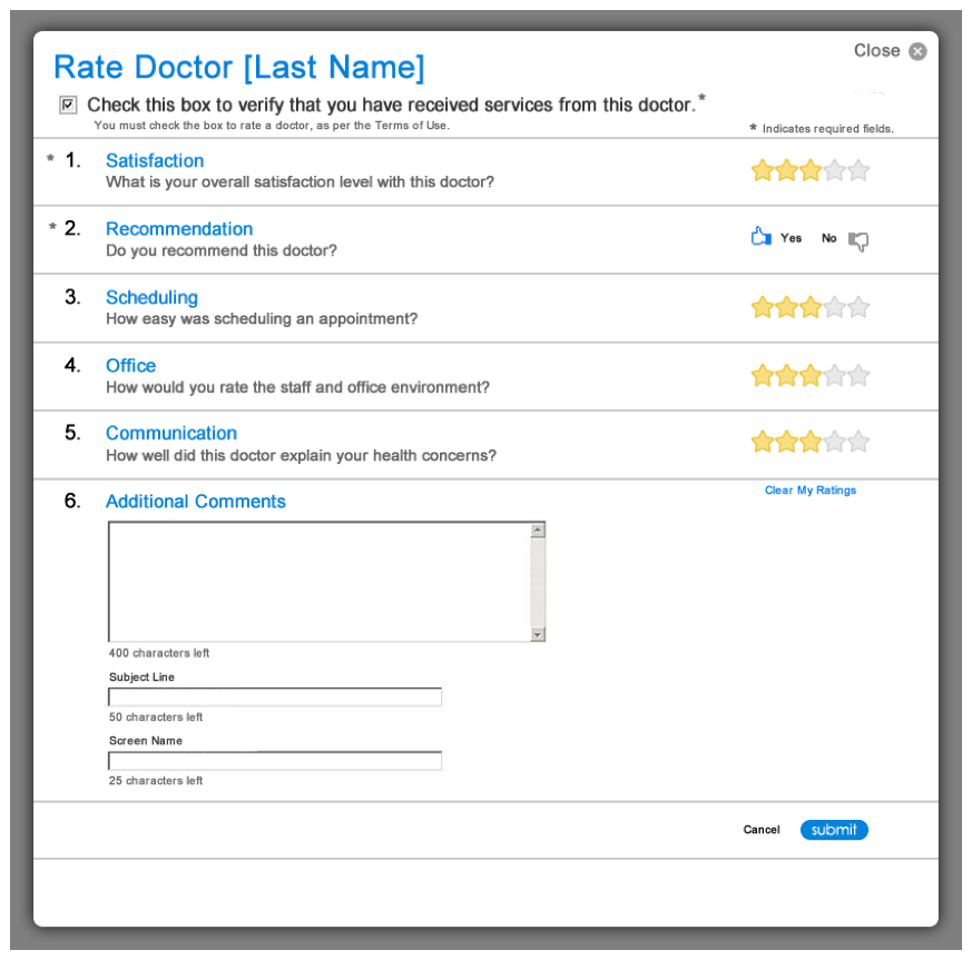
- Lightbox: (or modal window) to collect comments and ratings without having to leave or load a page.
- Form: utilize best practices in layout of form fields, labels and controls, with AJAX based form handling.
- Task analysis: research to determine what tasks are supported for different types of users (authenticated vs unauthenticated).
- User flows: mapping out how user tasks take them through different sections and states.
Results of the change:
Smooth integration of vendor solution with the BSCA brand and experience.
Easy for users to scan ratings data and compare physicians.
A simple and fun way for patients to provide reviews.
