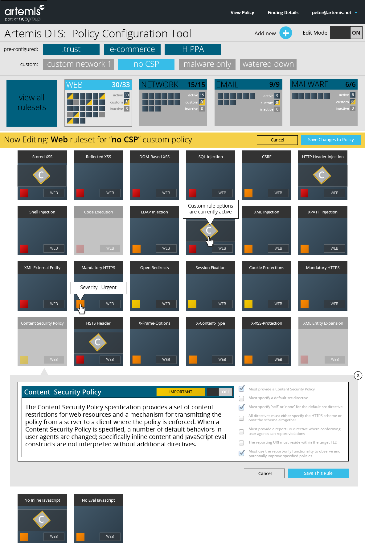
Here you can see my initial research and prep for creating a style guide.
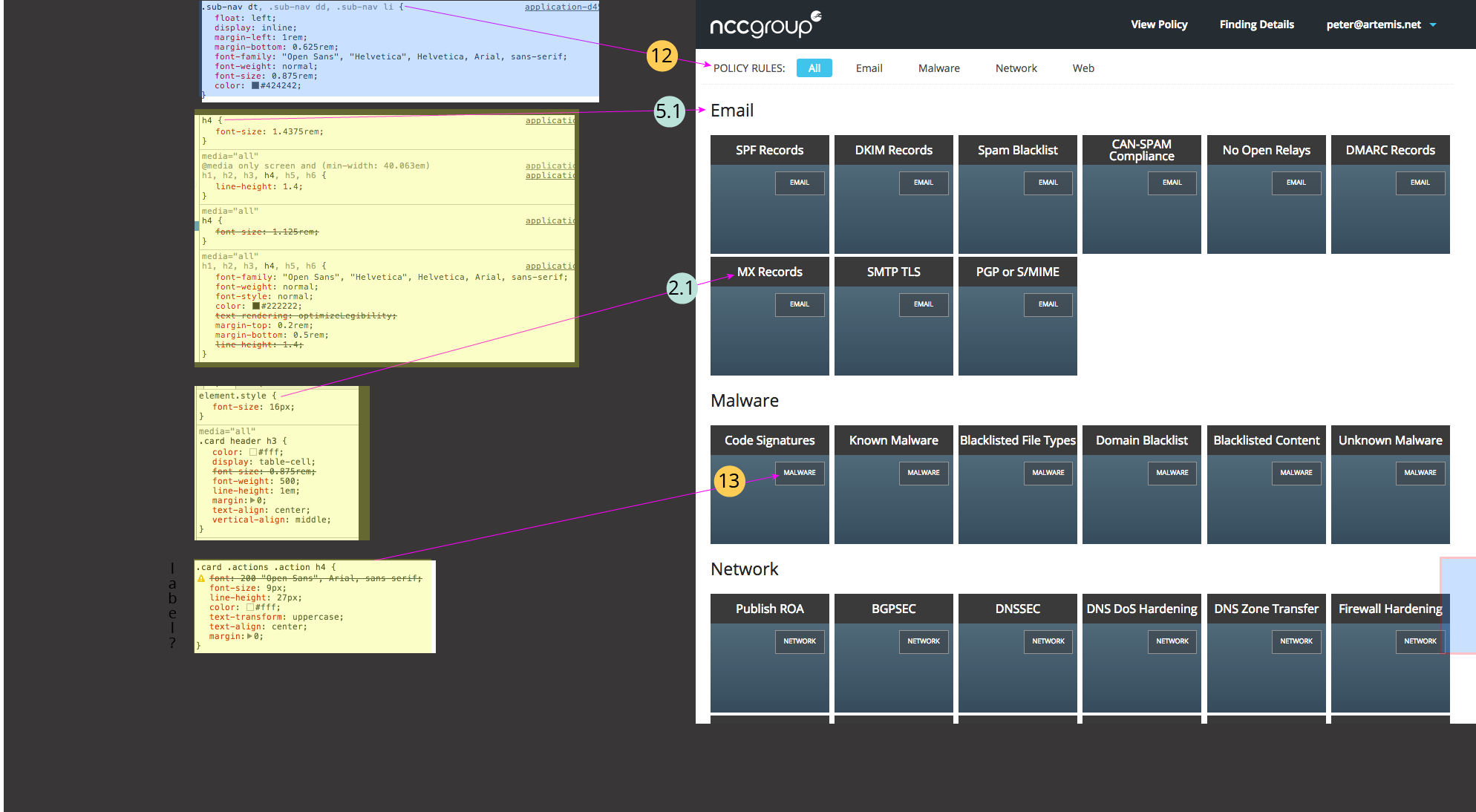
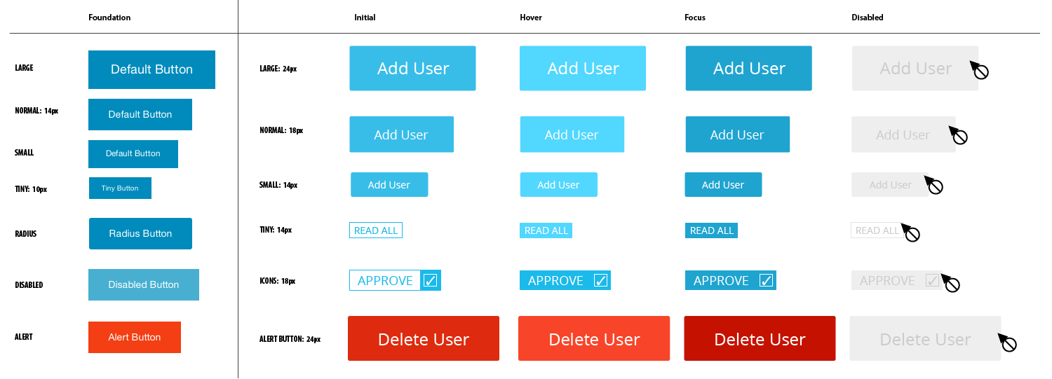
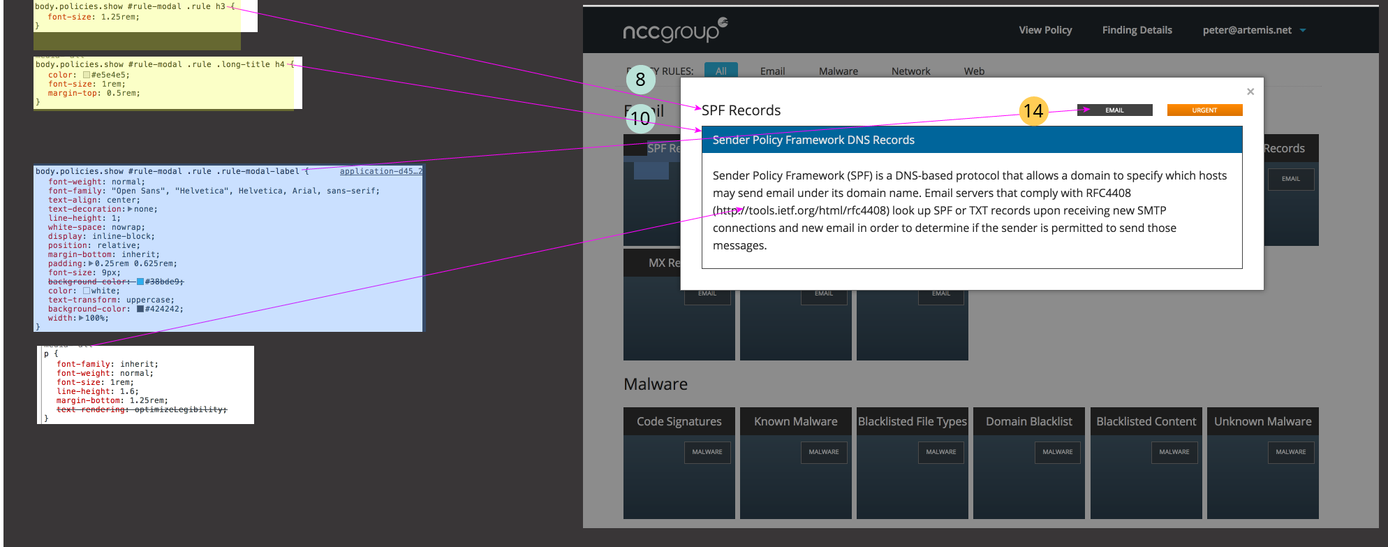
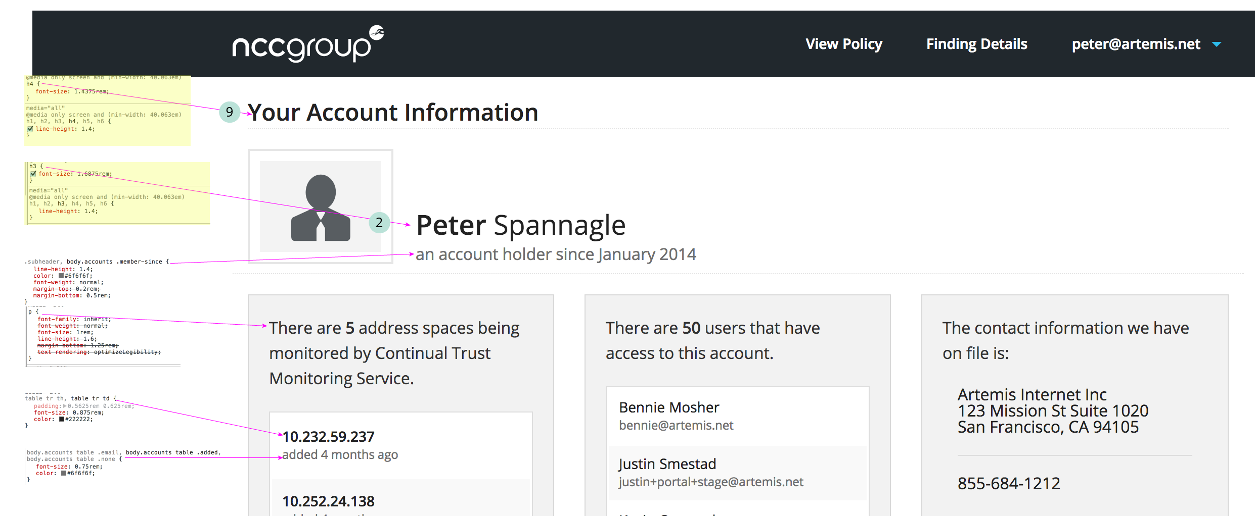
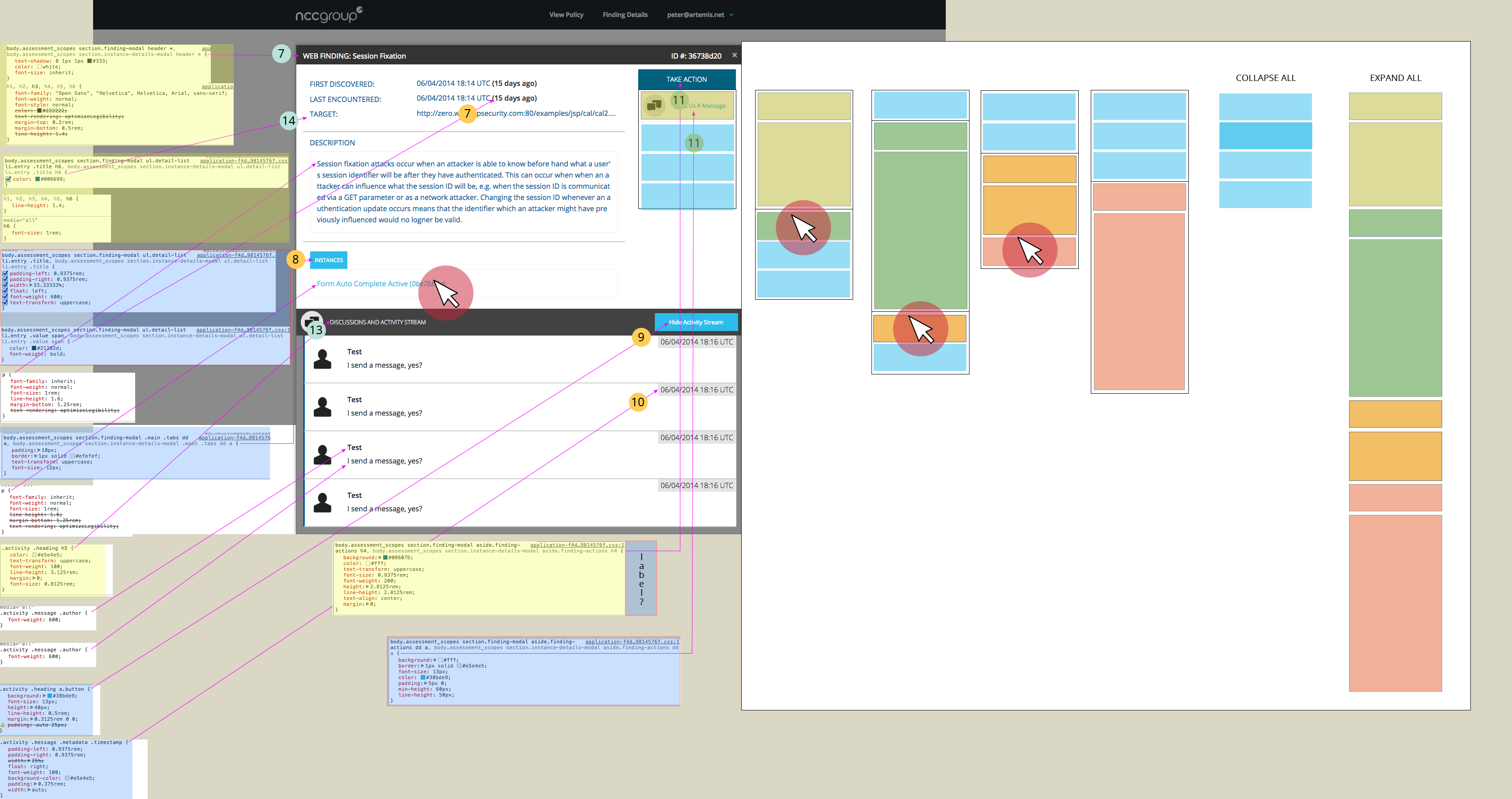
First I identified all the unique styles on each page for each page of our product. Then I superimposed and connected the specific CSS and HTML that create these styles. Yellow highlighting (with green numbers) indicates a heading, blue highlighting (with yellow numbers) indicates a button or label. Then I stepped back and thought about what is vs what should be. If you look at page 1, it’s clear that we should improve our semantic use of headings. By seeing everything together in one place, we are encouraged to take a more comprehensive and unified approach to our buttons and labels.
page 1: style guide prep overview
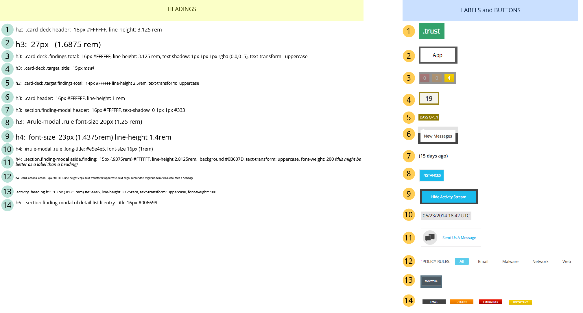
page 2: style guide prep — findings page
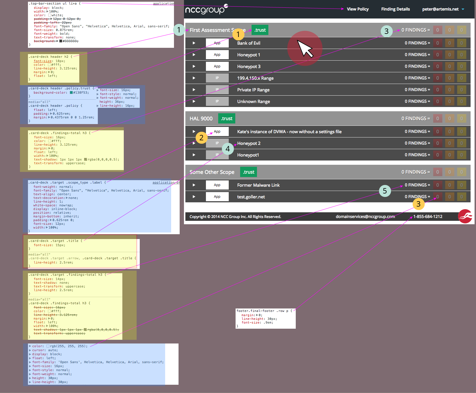
page 3: style guide prep — individual finding card
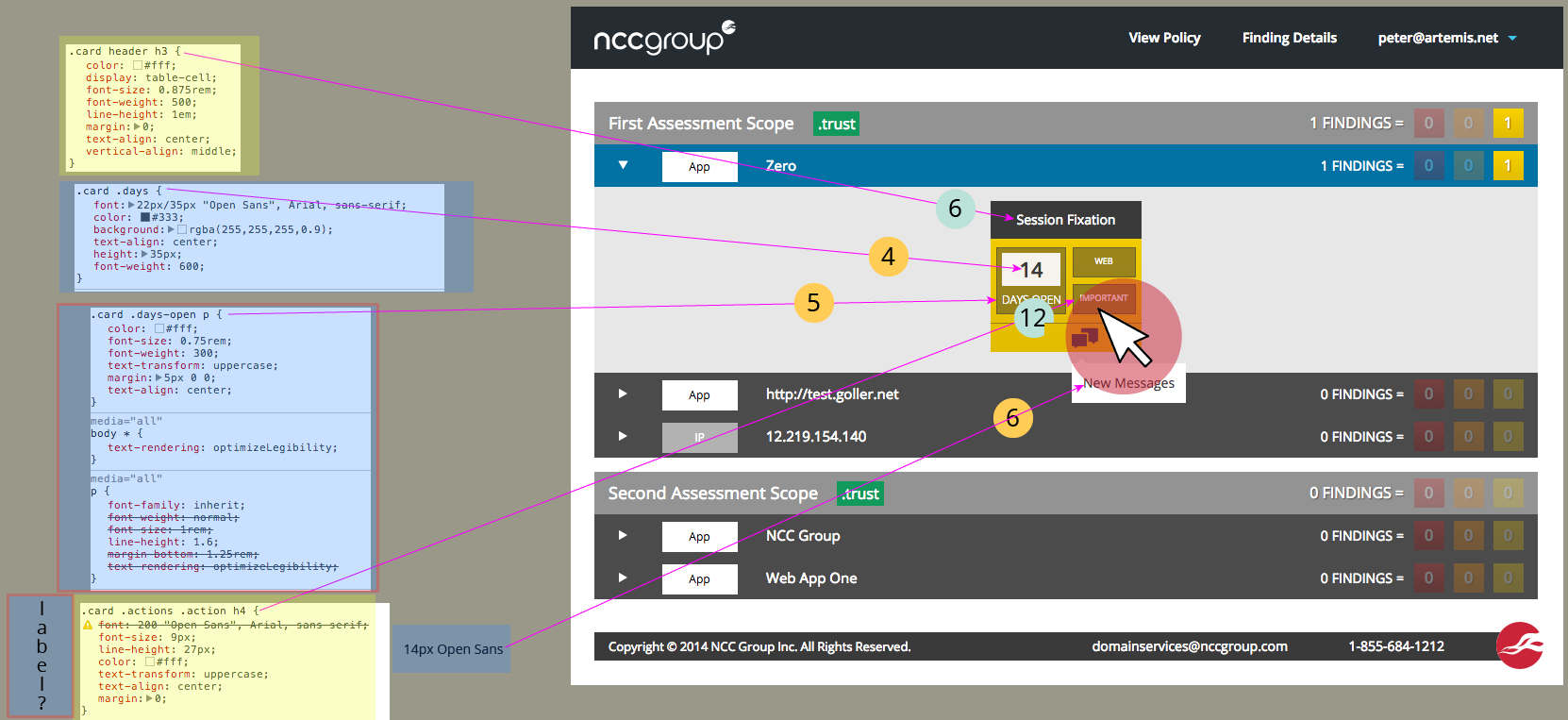
page 4: style guide prep — modal window 1
page 5: style guide prep — view policy
