HLI
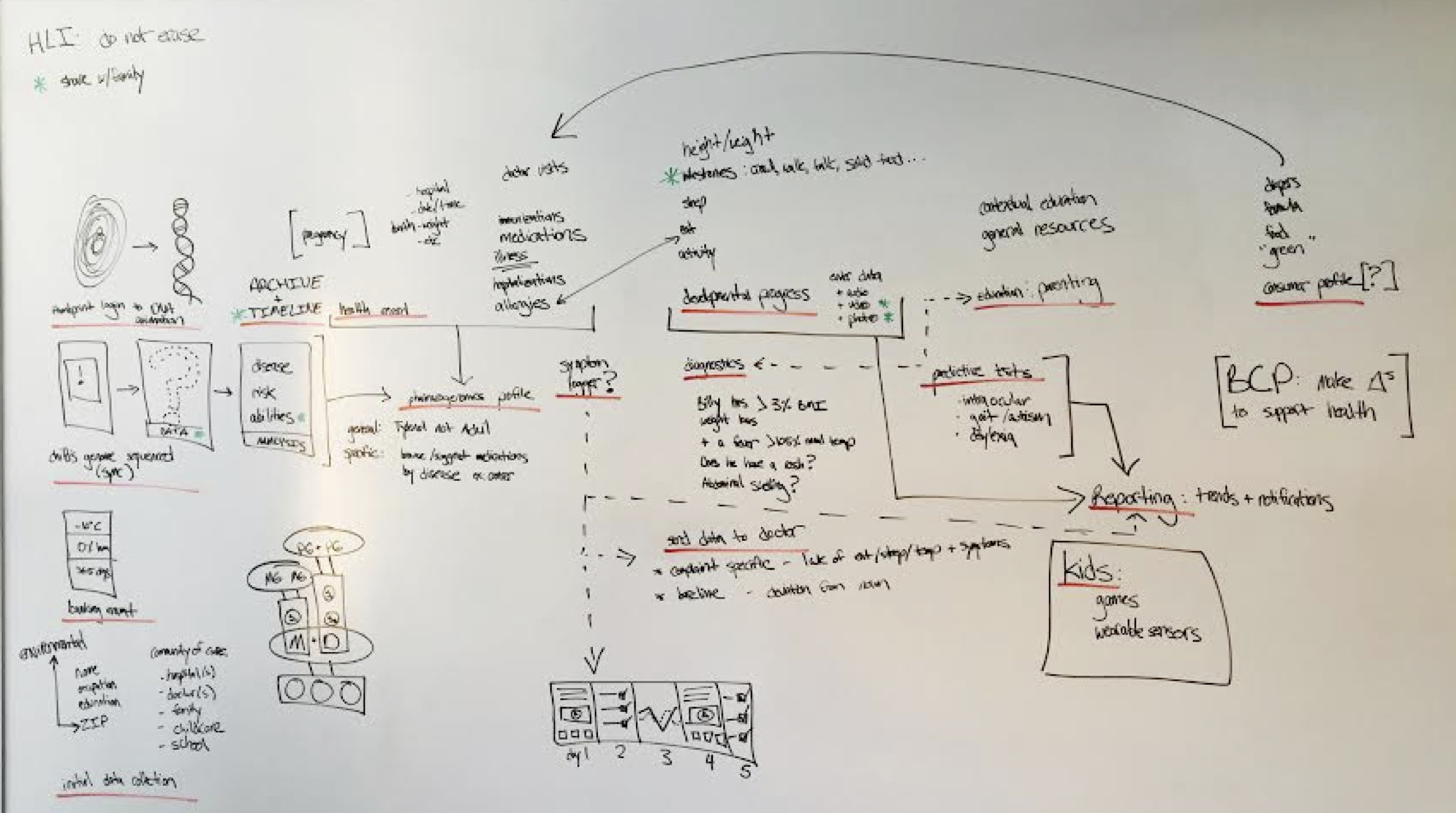
Human Longevity Inc is a San Diego based biotech company started by Craig Venter (first person to sequence the human genome), Bob Hariri (stem cell pioneer) and Peter Diamandis (founder of X PRIZE). HLI wanted to create a mobile app that would provide genetic insights for newborns and help moms track developmental data. I worked as the lead creative and PM, directing discovery and concept design, conducting client presentations and facilitating collaborative workshops.
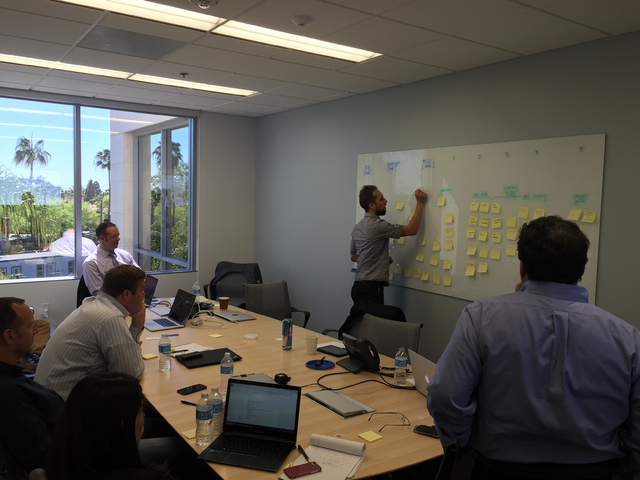
The goal of the first engagement was to craft a prototype that would secure additional investment. I sorted through their ambitious list of ideas and priorities for the app, brainstorming and contributing new ideas. We then packaged the concepts in a “visual narrative” that demonstrated the aspirations and promise of the app.
The second engagement was to define MVP and the product roadmap, including creative and technical estimation. I directed user research that included: organizing a research plan, executing the study and synthesizing the results.
Visual Narrative (1st engagement)
MVP Roadmap (2nd engagement)
- project outline
- card sorting exercise: roadmap and prioritization
- user research: study outline
- user research: data synthesis (check out the “summary”, “charts” and “map” sheets)
- features and functions (primary deliverable)
iPhone prototype
some pics
Taco Bell: DDI
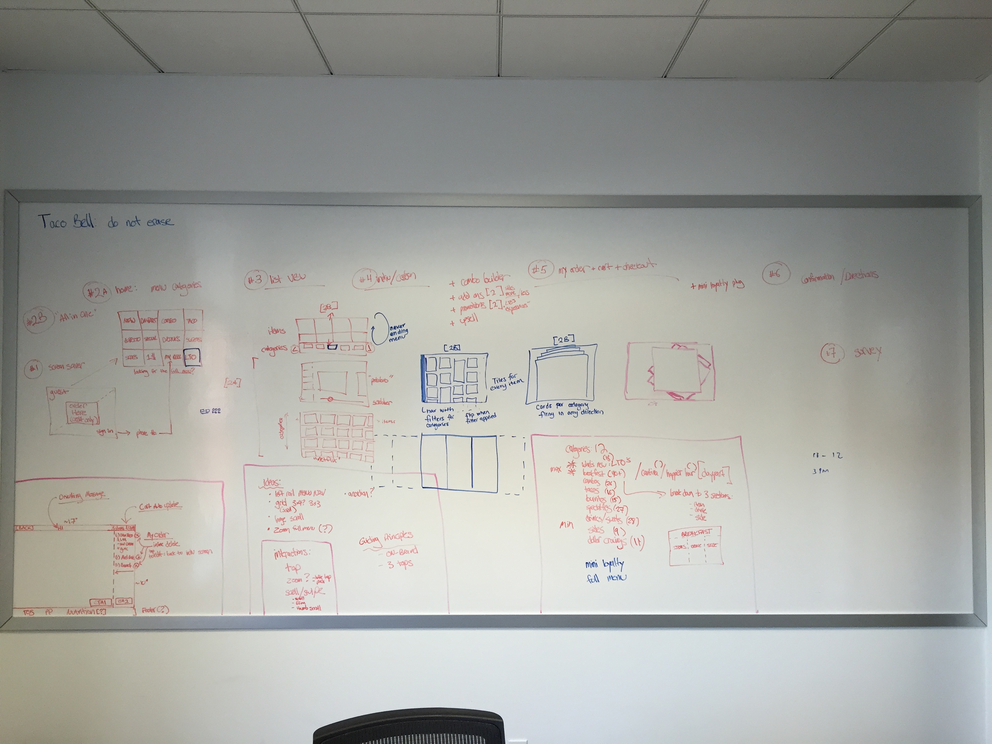
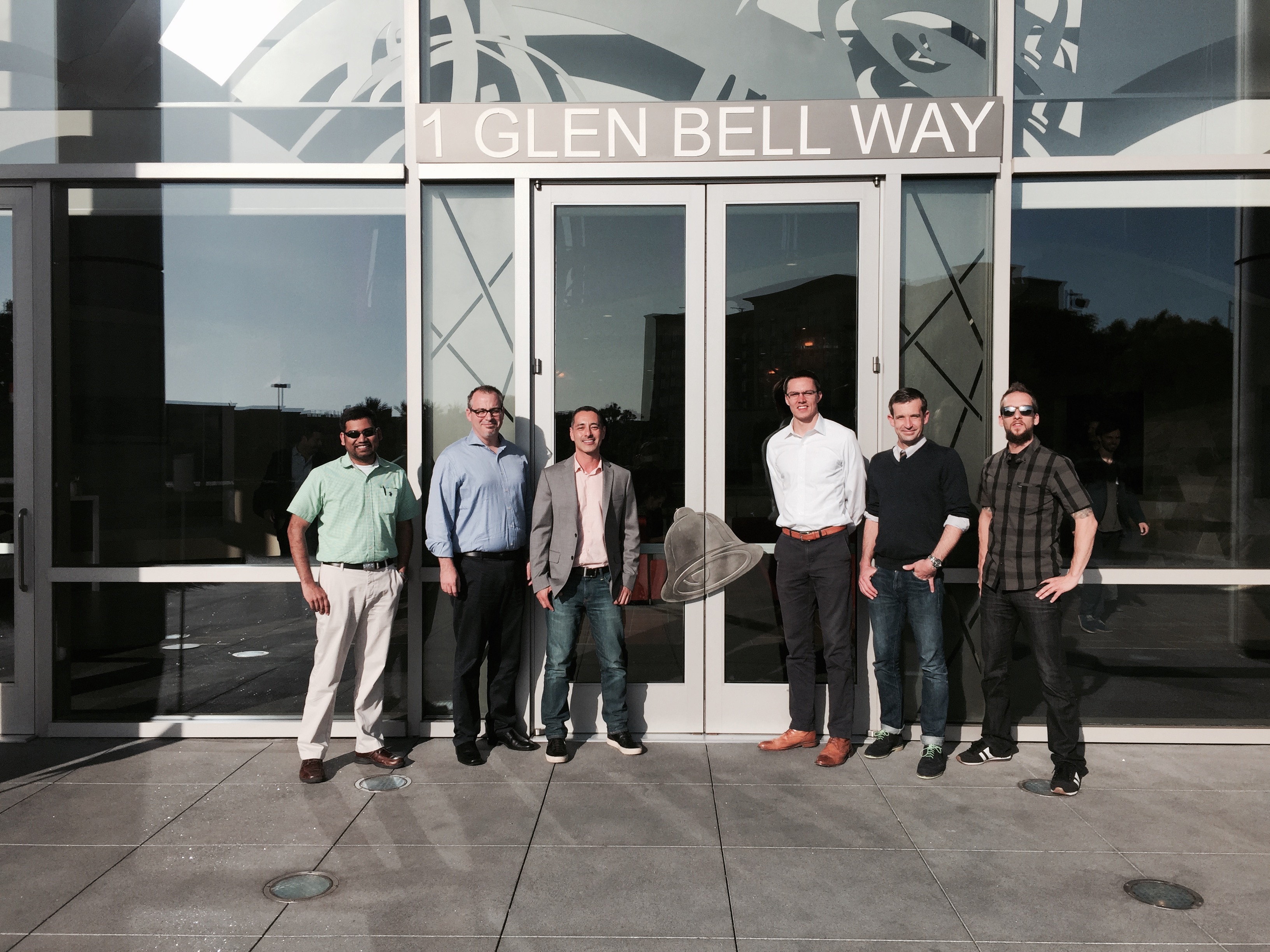
Digital Dine In is a pilot program of Taco Bell. The goal is to facilitate in store ordering and to increase check size by making it easy and fun to customize an order. Challenges include: navigating a menu of over 90 items, making ordering as fast as possible (~2 minutes), and having 16 weeks to design, build and QA an Android based kiosk solution.
Concept Deck: Customer Journey for TOMS
Here’s an example of some pitch work I did for TOMS. I had two meetings with the Director of Digital Customer Experience and the Product Manager. I presented the Concept Deck at the first meeting and facilitated a white boarding session. Then I took those inputs and turned it into the first Customer Journey TOMS had ever done (provided as a PDF and cut up in sections as a PPT to make it easier to discuss and share within the company).
Health Care Exchange and Benefits Administration
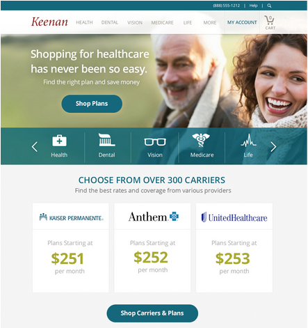
Keenan is the largest private insurance broker in California. I led two engagements with this client in which we created a public health care exchange, and redesigned both the Employee and Employer benefits administration portals.
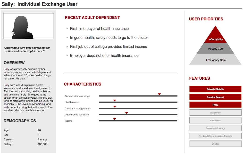
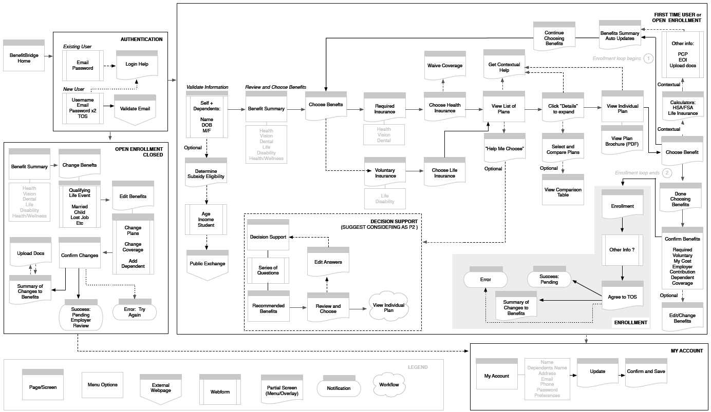
The first project was to create design deliverables to support the development of a new product (health care exchange) and redesign an employee benefits administration tool. I did extensive discovery, made estimates and projections, assisted in refining project scope, and created personas, user journeys and wireframes.
The second project was to redesign the benefits administration tool for advanced and internal users, including HR admins.
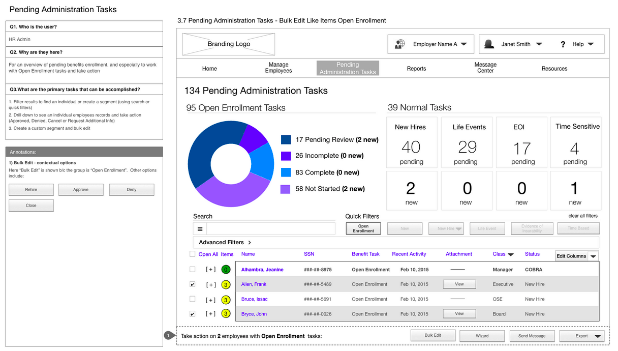
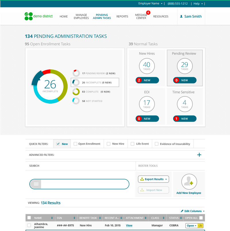
As the Principal UX Architect and Project Manager, I led this 12 week project through scoping, discovery, concept design, and visual design. I was the primary client interface, leading on site and remote meetings with the client’s cross functional team of executives, managers, technical leads and SME’s. Internally, I managed a creative team of 5: 2 UX designers and 3 visual designers. We delivered 70+ final screens. Below are two examples of going from wireframes to visual designs. You may also want to review the spreadsheet I created to track these deliverables.
Pending Administration Tasks (wireframe)
Pending Administration Tasks (visual design)
Health Care Exchange and Employee Portal
This was my first project at Mobiquity. I served as the Design Lead (Principal UX Architect). Managed a team of 3 (Sr UX Designer, Content Strategist, Visual Designer) and worked alongside the Project Manager and Creative Director. Responsible for client presentations, concept work and annotated wireframes.
Personas
